For most businesses, email marketing is the best way to communicate with customers or clients – no matter if they are in the B2B or B2C segment. Making these communications effective depends on many factors, including email design. We believe that good email design can change the way companies communicate and help them to reach a broader audience.
In this post, we will outline the Top 7 email design best practices. After working with a wide variety of clients across several industries and sectors, we found that these recommendations hold true for all businesses, and by implementing them you can improve the appearance AND the effectiveness of your emails:
1. Focus on one goal. When creating a new email, think about the main purpose of the email. If the email’s end goal is to encourage people use a promo code, include only one promo code call-to-action (CTA). Don’t ask customers to subscribe to a newsletter or check out new releases in addition to initial CTA.
Communicating with one single message is more effective than trying to add 3 different messages in one email. Expecting clients to act on multiple things might confuse subscribers, and a confused mind will say “no” to all offers.
The message that you are trying to convey to a client should start with a compelling subject line or preheader and end with a clear CTA. Everything should be aligned, leaving no room for confusion regarding the purpose of the email.
2. Prioritize Mobile. When crafting a new campaign or building a new email mock-up, think about mobile first. It is reported that 85% of users use smartphones to access email, and that almost half of all emails are opened on mobile. And this number increases every year.
On top of that, reports suggest that 60 to 70% of users delete an incorrectly loaded email, and 15% reportedly unsubscribe completely when that happens. With this consideration, it makes sense to keep mobile design at the forefront when creating new client communication.
3. Keep it simple. Trying to stand out among competitors, many companies try to make their emails flashy and engaging by using heavy graphics and sophisticated design. Unfortunately, not all email clients can support those features and render emails correctly. Instead, broken emails and half-rendered email elements can leave clients with a broken email, distorted communication, and a negative impression of your company or brand.
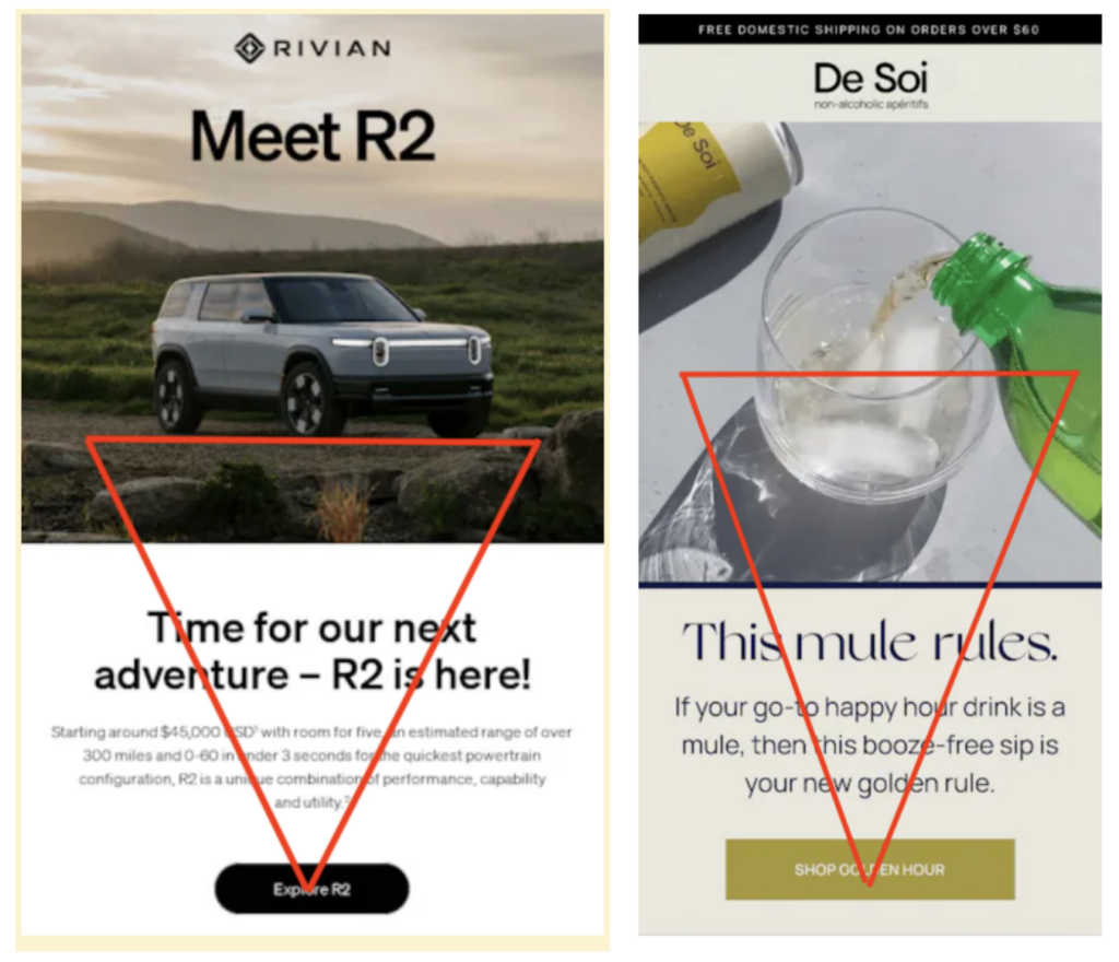
The recommendation is to keep the email as simple as possible. One-column emails are always a safe bet in terms of proper rendering. We often see success when clients employ a layout called ‘Inverted Pyramid’ or ‘Inverted Triangle’. This is when an image is followed by Header Title & Header Content and CTA (at the bottom). The below examples from Rivian and De Soi both demonstrate a good use of this principle. It keeps things clean and simple, and naturally draws the reader’s eye to the CTA.
Email images from Really Good Emails.
4. Embrace the dark mode. First introduced by Apple Mail in 2018, dark mode became popular in email marketing as it is easier on the eyes and reduces screen brightness. In simple terms, dark mode uses partially or fully inverted colors. Even though not all email clients support dark mode, we do recommended attempting to build emails with dark mode in mind.
Typical emails with light background and contrasting images do not display as well when in dark mode. Beyond this, they can be difficult to read due to dark-colored fonts (which is less than ideal for an email).
The best approach is to adapt emails to dark mode, meaning that the background color changes from black to grey or dark grey. Switching from default black font to a lighter-colored one would make any email more readable. It’s also important to consider dark mode when choosing images and icons.
5. Maintain text-image ratio. White space plays an important role in email marketing, in the same way it does on websites or any other documents. Overloaded and extremely long emails will make subscribers bored and less likely to engage with the content on the page. Instead of large blocks of text, use space between paragraphs and bullet points save space (especially on mobile) and keep the readers interested. A simple layout and a balance between images and text will be more compelling for customers and help convey your message more effectively.
6. Use ALT tags. Many clients neglect alternative or ALT tags thinking that they are optional. It is best practice to use ALT tags, as they become especially handy when images are not loaded properly. This can happen when the internet connection is not stable, when images are turned off, or a corporate firewall prevents emails from loading. The latter is especially true for corporate Outlook emails.
If images are not rendered for various reasons, ALT tags can help ensure that readers can still have an idea what was on that image. This is also a good accessibility practice, in the event that a your reader is using a visually assistive technology (like a screen reader).
ALT tags should describe the image clearly. For example, an ALT tag that says ‘Apply 10% Promo Code’ is more useful than one that simply says ‘% logo’. This should also align with CTA copy. ALT tags should be short and concise – avoid using full sentences. It’s also recommended that ALT tags be styled, so that the they align visually with the rest of the email copy.
7. Use CTAs in the right way. A call to action (or CTA) is short email copy that invites the reader to take a certain action. To be effective, it has to be interesting enough for customers to click on it. Here are some rules to help with compelling CTAs.
- Only one CTA at a time: The CTA is one of, if not the most, important parts of the email. For that reason, keep it simple. Don’t confuse your reader using more than one CTA under a single message/story.
- Avoid image CTAs: Using images instead of actual CTAs might be tempting. If they render correctly, rounded corners and borders look consistent (especially, in Outlook). But… this is all assuming that images are rendered correctly, which we know is not always the case. In some scenarios, subscribers will end up with improperly rendered CTA or just ALT tags. In real life, there is always a chance that images won’t be fully loaded correctly and customers won’t see CTA. For that reason, it’s best to stick to conventional CTA buttons.
- The CTA copy should be short and concise: Phrases like like “Apply Today” or “Book Now” are the most effective. Avoid using full sentences or phrases. In most cases, this won’t be mobile friendly as it will break buttons.
- Use fully-clickable CTAs: This will streamline your design AND make the emails more effective.
And lastly, seek inspiration! There are few free resources like Really Good Emails or Email Love where examples of effective emails are collected in one place. Getting inspiration from other people who are doing a great job is often a good place to start. And being thoughtful with your email design can bring communications to the next level.
Conclusion
All companies, regardless of its size, industry, or segment have to consider good email design as part of their marketing strategy. Using industry best practices and implementing these tactics can help to communicate effectively with your readers and avoid unwanted unsubscribes.
If you still have questions or struggle building emails, feel free to drop us a message or contact us. We love talking about email design and would be happy to discuss with you!


